


Most small apparel teams don't have a data problem. They have a decisions problem dressed up as a data problem.
You've got numbers everywhere — the POS spits out reports, the e-com backend has its own analytics, the spreadsheet the owner built in 2021 still gets updated most Mondays. But when it's time to decide what to reorder, what to mark down, or which vendor to cut, everyone goes quiet and defaults to gut feel. The dashboards exist. They just don't connect to any actual choice someone has to make on Tuesday morning.
That's the gap this roadmap closes. Over 12 weeks you'll stand up five dashboards that each answer a real buying or merchandising question, assign a human owner to every number, put light data-quality gates in place so nobody argues about whether the report is even right, and start a small experiment log so your team stops relearning the same lessons every season.
This isn't about building a "data culture." Small teams don't have the headcount for that, and it's mostly a phrase people say in meetings. It's about wiring your reporting so it forces a decision on a fixed cadence.
Why analytics goes stale in small stores (and it's not laziness)
The failure pattern is almost always the same, and it has very little to do with how smart the team is.
A store opens, the owner tracks everything in their head. Sales feel good, reorders happen when the rack looks thin. Then volume grows — a second location, a stronger online channel, more vendors — and the mental model breaks. So someone builds reports. Usually a lot of them, fast, in a panic, because a bad buy just cost real money.
The trap: those reports get built around what the software can easily export, not around what decision needs support. So you end up with a dashboard showing total revenue by day, sessions by channel, units sold by category — all technically true, all completely useless for deciding whether to reorder the olive utility jacket in size M before it sells through.
What tends to happen across a lot of small retailers is that the reports pile up but the decision-making stays exactly where it was: reactive, gut-driven, and slightly anxious. More dashboards actually make this worse, because now there's ambiguity about which number to trust. Two reports show slightly different sell-through and nobody knows why, so both get ignored.
The second failure is ownership. When a number is "everyone's job," it's nobody's. The sell-through report drifts because the person who used to check it went on maternity leave and never formally handed it off. Six weeks later someone notices the reorder points are stale and you're out of your best-selling denim.
If you haven't already sorted out which metrics deserve attention in the first place, start with the thinking in the apparel KPI framework that tells small stores what to act on — this roadmap assumes you've made peace with ignoring the vanity stuff.
The core idea: every dashboard maps to a decision, every decision has an owner
A dashboard that doesn't change a buying or merchandising decision gets deleted.
Take control of your clothing store operations.
Werzly helps you manage stock, process orders, and engage customers effortlessly.
- Unified inventory and order management
- Automated customer notifications
- Sales and stock analytics
No credit card required
That's the filter. Not "is this interesting" or "is this trackable" — but "when this number moves, who does what, and by when?" If you can't answer that, the dashboard is decoration.
The five dashboards below each tie to a specific recurring choice your team already makes. The whole point is to attach data to decisions you're going to make anyway, so nobody's doing extra work — they're just doing the same work with a real signal instead of a hunch.
The five must-have dashboards
| Dashboard | Core question it answers | Owner | Decision cadence |
|---|---|---|---|
| Sell-through & reorder | What's selling fast enough to reorder, and what's stalling? | Buyer | Weekly |
| Size & fit health | Which SKUs are breaking size curves or driving returns? | Buyer / Ops | Weekly |
| Markdown & aging | What crosses the markdown threshold this week? | Owner / Buyer | Weekly |
| Channel margin | Where is each dollar actually most profitable after costs? | Owner | Bi-weekly |
| Vendor performance | Which suppliers are reliable, and which cost us margin? | Buyer | Monthly |
Notice what's not on this list: total site traffic, follower counts, "engagement," daily revenue with no context. Those get looked at maybe monthly, out of curiosity, and they never drive a buy.
The 12-week roadmap
The pacing here matters. Trying to launch all five dashboards in week one is how you end up with five half-broken reports nobody trusts. You build one, run it live for a couple weeks, fix the data problems that surface, then add the next. Data quality reveals itself only when someone actually depends on the number.
A quick visual of the 12-week rollout:
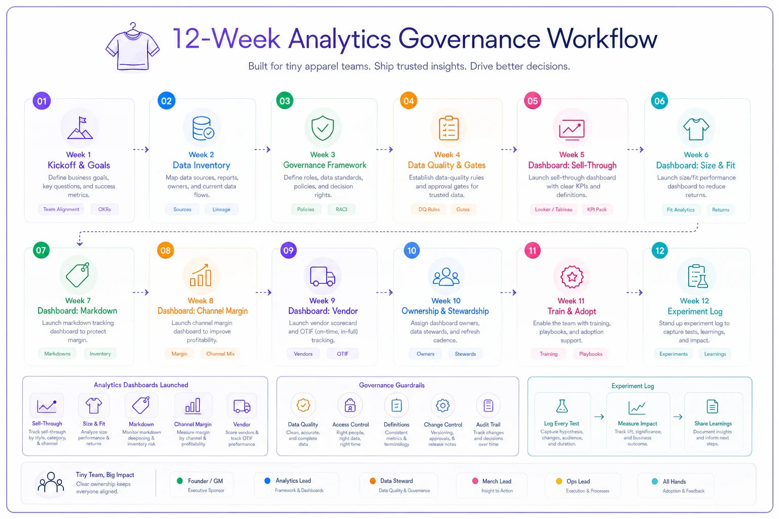
Weeks 1–2: Foundation and the first dashboard (Sell-through & reorder)
Don't start by building. Start by writing down, for each of the five dashboards, the exact decision it supports and who makes that call. One page. If two people both think they own reorders, you just found your first real problem — solve it before touching any report.
Then build only the sell-through dashboard. Keep it brutally simple: SKU, units sold last 7/14/30 days, current on-hand, weeks of cover remaining, and a flag for anything below your reorder threshold.
The data-quality gate for this week: inventory counts have to be trustworthy. If your on-hand numbers are off by 15% because receiving doesn't get logged consistently, the whole dashboard lies to you. Spend the time here. A sell-through report on top of bad inventory data is worse than no report, because it gives false confidence.
A realistic first-week discovery: you'll find SKUs showing "8 weeks of cover" that are actually near sold-out because the counts never got reconciled after the last markdown event. That's normal. That's the point of running it live.
Weeks 3–4: Ownership playbook and size/fit health
Now formalize ownership. For each dashboard, write a tiny ownership card:
-
Who owns it (one name, not a team)
-
What they check (the specific flags, not "review the data")
-
When (day and time — "Monday 9am before the floor opens")
-
What triggers action (the threshold that means do something)
-
Who they escalate to (when the number is weird or a big-money call)
Then build the size/fit dashboard. This one surfaces broken size curves — where you're sold out of M and L but sitting on XS and XXL — and connects to return reasons where you can capture them. Broken curves are a silent margin killer; you look "in stock" on paper but you're out of every size a real person wants to buy.
The data gate here: size and SKU data has to be clean and consistent. If the same jacket exists under three slightly different SKUs because it got received wrong twice, no size analysis works. This is exactly why a single source of truth for SKUs, sizes and vendors pays off before you try to analyze anything — messy master data poisons every downstream report.
Weeks 5–6: Markdown & aging dashboard
By now your team is used to two live dashboards. Add the markdown one. It should list every SKU by age band (0–30 days, 31–60, 61–90, 90+) with sell-through velocity, and automatically flag what's crossing into markdown territory based on rules you set — not vibes.
The insight most small teams miss: markdowns shouldn't be a seasonal panic event, they should be a weekly trickle of small, rules-based decisions. A dashboard that flags three SKUs a week for a 20% cut keeps you from that horrible end-of-season moment where 40% of the floor is aged inventory and you're slashing 50% just to move it.
Data gate for this one: receiving dates have to be accurate. Aging analysis is only as good as your "date first on floor" field. If that's blank or wrong for half your SKUs, the whole thing collapses.
Weeks 7–8: Channel margin dashboard
This is the one that changes the most minds. Small multi-channel stores almost always overvalue their online channel because they look at revenue, not margin after shipping, returns, packaging, and payment fees.
A typical example: online looks like it's driving 35% of revenue and everyone's proud of it. Then you load actual costs — a return rate pushing 25–30% on certain categories, shipping subsidies, higher packaging cost — and the contribution margin from online is thinner than the in-store margin on the same products. Suddenly the plan to "push everything online" looks a lot less obvious.
Build this to show, per channel and per category: revenue, gross margin, return rate, and contribution margin after channel-specific costs. Bi-weekly cadence is fine — this drives strategy, not daily moves.
Data gate: you need channel-specific cost inputs, even rough ones. Approximate shipping and return costs beat pretending they're zero. Uneven, honest numbers are more useful than precise fantasy.
Weeks 9–10: Vendor performance dashboard
The last dashboard closes the loop back to buying. Track, per vendor: sell-through of their goods, return/defect rate, on-time delivery, size-accuracy issues, and realized margin after markdowns. This is what tells you a vendor you love aesthetically is actually costing you money once you account for the markdowns their stuff always ends up needing.
Monthly cadence. This feeds directly into your buying and negotiation. When a vendor rep pushes for a bigger order, you want the realized-margin number in front of you, not the memory of how well their spring line photographed.
Data gate: vendor tagging has to be consistent. Every SKU needs the right supplier attached. This sounds trivial and it's where half of vendor analysis silently fails.
Weeks 11–12: The experiment library and measurement cadence
The last two weeks are about making the whole thing self-improving instead of static.
Start an experiment log — one shared doc or sheet, dead simple. Every time you try something (a markdown timing change, a new size buy strategy, moving a category's default channel, a display change tied to fitting-room conversion), you log:
-
The hypothesis ("cutting outerwear 15% at day 45 instead of day 60 will lift full-price-adjacent sell-through")
-
What you changed and when
-
What metric you're watching and on which dashboard
-
The result after a set window
-
Keep / kill / adjust
This is the thing almost nobody does, and it's why small stores relearn the same lessons every year. Without a log, the knowledge lives in one person's head and walks out the door when they do.
Then lock your measurement cadence so it doesn't drift:
-
Weekly (15 min) Sell-through, size/fit, markdown flags → reorder and markdown decisions
-
Bi-weekly (20 min) Channel margin → allocation and channel-push decisions
-
Monthly (30 min) Vendor performance + experiment log review → buying and negotiation
-
Quarterly Prune dashboards. Anything that hasn't driven a decision in 90 days gets cut.
That quarterly prune is not optional. Dashboards accumulate like junk drawers. The discipline to delete is what keeps the system usable.
Where the right tooling quietly helps
None of this requires expensive analytics software, but there's a real ceiling on what you can hold together manually. The moment your five dashboards live in five different exports that someone stitches together by hand every Monday, the data-quality gates start slipping — because manual reconciliation is exactly where errors and shortcuts creep in.
Workflow platforms that centralize inventory, sales, and vendor data into one place earn their keep here. Not because of any buzzy angle, but because the boring stuff — keeping SKU and vendor tags consistent, flagging when on-hand counts drift from expected, auto-surfacing SKUs that cross a markdown threshold — is precisely the kind of repetitive checking that eats a small team's time and gets skipped when things get busy. Light automation on the data-quality gates means the report is trustworthy without someone babysitting it, and your people spend their limited hours on the decision, not on cleaning the spreadsheet.
Light automation on the data-quality gates means the report is trustworthy without someone babysitting it, and your people spend their limited hours on the decision, not on cleaning the spreadsheet.
The rule stays the same either way: the tool serves the decision. If a dashboard doesn't change what you buy or mark down, it's still decoration, no matter how it's built.
When this roadmap makes sense — and when it doesn't
This makes sense when: you're running at least a couple hundred active SKUs, you've got more than one sales channel or location, and buying decisions are starting to cost real money when they go wrong. If reorders and markdowns feel like guesses and a bad guess stings for weeks, you're ready.
This is overkill when: you're a single tiny shop with 80 SKUs and one channel, and you genuinely can hold the whole picture in your head. Don't build governance for a business that doesn't need coordinating yet. You'll just create maintenance work.
Who should NOT do this yet: anyone whose inventory counts are fundamentally untrustworthy. If receiving is chaotic and on-hand numbers are fiction, fix the operational basics first. Dashboards on top of broken inventory data don't help — they mislead with confidence. Get your counts reliable, then come back to week one.
A real scenario
A two-location boutique — roughly 400 active SKUs, a modest online store — had the classic problem: plenty of reports, no rhythm. Reorders happened when a rack looked empty, markdowns happened in a big anxious sweep twice a year. End-of-season clearance was routinely eating a significant chunk of potential margin because aged inventory piled up unnoticed.
They ran this roadmap over a quarter. The changes that mattered weren't dramatic. The weekly sell-through review caught reorders about two weeks earlier than before, which cut a handful of painful stockouts on their best sellers. The markdown dashboard turned the twice-a-year panic into a weekly trickle of small cuts, and their end-of-season clearance pile shrank noticeably — they were moving aged stock at 20% off instead of desperation-slashing at 50%.
The channel-margin dashboard delivered the real surprise: online, which they'd been planning to lean into hard, was contributing thinner margins than they assumed once returns and shipping were honestly costed. They didn't kill online — they just stopped subsidizing it blindly and shifted some categories back to an in-store-first push.
Nothing here was a hockey-stick transformation. It was a store that went from reacting to deciding, on a schedule, with numbers people actually trusted. That's the whole win.
The point of all this
The goal was never "more analytics." Plenty of small stores are drowning in reports and still flying blind.
The goal is a small set of dashboards that each force a specific decision, owned by a specific person, checked on a specific day, sitting on top of data clean enough that nobody wastes the meeting arguing about whether the number is right. Build it one dashboard at a time. Let the data-quality problems surface by depending on the numbers. Assign real owners. Log your experiments so the store gets smarter instead of just older. Prune ruthlessly — the discipline to delete a useless dashboard is what separates a system that lasts from another abandoned spreadsheet.
Twelve weeks in, you won't have a "data culture." You'll have something better: a store that makes its buying and merchandising calls on rhythm, with evidence, and stops relearning the same expensive lessons every season.
Ready to elevate your apparel business?
Join 2,000+ retailers using Werzly to streamline operations, increase sales, and deepen customer loyalty.